

Donut Chart
To create a Doughnut Chart widget that displays data in a circular format without a center, providing a clear visual representation of proportions and percentages within a dataset. It provides an easy way to understand how various data segments relate to each other or how categorical data is distributed.
Use Case: Energy Consumption by Department
A donut chart can represent the percentage of total energy consumption by different departments within an industrial facility. Each segment of the donut represents a department, with the size proportional to its energy usage. This visualization helps stakeholders understand which departments are the largest energy consumers and identify opportunities for energy-saving initiatives.
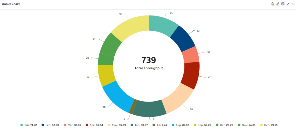
Donut Chart
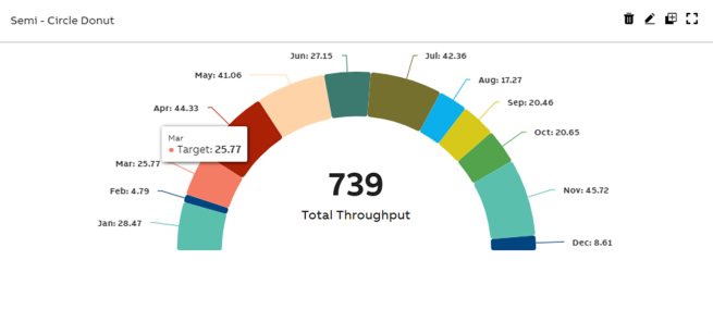
Semi Circle Donut Chart
Configuration Options
To learn about common configuration options, refer to the following topics from the Edit Widgets section:
Label | Description |
DataSource | See DataSource |
Events | See Events |
Link | See Link |
Help | See Help |
Refresh | See Refresh |
Styles
On the Styles tab, add the following details to create the Donut Chart Widget:
Option | Description |
Title | Title or Label of the widget to be displayed in the dashboard. You can either enter the title manually or click the + icon to open the Parameter Value Configuration pop-up and select the name. For more information, see Variable Usage. |
Subtitle | Enter a short description of the KPI represented in the widget. It will be displayed below the chart title. You can either enter the subtitle manually or click the + icon to open the Parameter Value Configuration pop-up and select the name. For more information, see Variable Usage. |
Category Axis Column(X-Axis) | Choose from the dropdown to assign data to the Category Axis (X-axis). |
Value Axis Columns(Y-Axis) | Choose from the dropdown to assign data to the Value axis (Y-axis). |
Donut Size (%) | This field is used to set the size of the chart (presumed to be in percentage). |
Border Width | This field is used to configure the border widget for series. |
Legend | Select the checkbox to display Legends (Align, Vertical Align, and Layout) in the Widget. |
Data Label | Enable the Data Label checkbox to display numerical values directly above each data point on the chart. Once enabled, additional customization options appear:
|
Custom ID | The value in this field gets automatically filled out by the dashboard. This field helps to identify the widgets while configuring events. This can be user-defined as well. |
Export CSV | Enable this checkbox to download the information from donut chart in CSV format. |
Export JPEG | Enable this checkbox to export in JPEG format. |
Export PNG | Enable this checkbox to export in PNG format. |
Align | Choose from dropdown to place the legend either on left, center or right of plot area. |
Vertical Align | Choose from dropdown to place the legend either on top, middle or bottom of plot area. |
Layout | Choose from dropdown to list the legend either horizontally, vertically or proximately in plot area. |
Show value in Legend | Enable this checkbox to display the respective legend's value along with the legend. |
Show Total Legend | Enable this checkbox to display the sum total value of all the available legends. |
Semi Circle | Enable this checkbox to display the half donut chart. |
Show Count in Center | Enable this checkbox to display the total count at the center of the donut chart. |
Widget Count Title | Enter a title to display alongside the total count in the center of the donut chart. |
Tooltip | To configure tooltips in the plot, click the +Tooltip option. This lets you define multiple custom tooltips that appear when hovering over data points. Once you click +Tooltip, additional configuration fields appear:
The columns shown in the tooltip or data table are dynamic and vary based on the dataset retrieved from KSH. |
View Types | Choose to view the data level to show percentage or value. |
Borderless Header | Enable this checkbox to hide the border of the title. |
Frameless | Enable this checkbox to hide the frame around the widget. |
Fullscreen | Enable this checkbox to view the widget in full-screen mode. |
The Series tab consists of the following fields:
Field | Description |
|---|---|
| Color | Allows you to select color for the series. Click the dropdown menu and select the required color. |
| Opacity | Indicates widget's transparency level to be used on a background image. Default is 1, indicating No Transparency. Set to 0 for full transparency. Range is from 0 to 1. |